Learn to DevArt: Learning to draw shapes with CSS for website makers. #LearnInPublic
Learn to DevArt: Learning to draw shapes with CSS for website makers. #LearnInPublicOne of the things I enjoy about being a developer, is the learning mindset that identifies us as community.
Recently I learned about the concept Learn in Public. The concept of learn in public, is basically: Pick a skill you want to learn, practice it, post about it. Simple but refreshing.
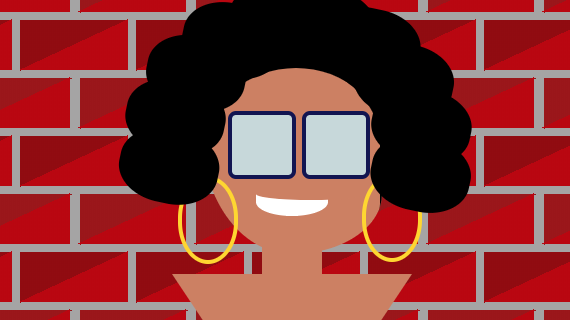
So, I have decided to learn in public about making art with code. Yet the path feels long, the first easy step for me was to draw something with CSS. In this case, myself.
So. Here we go!
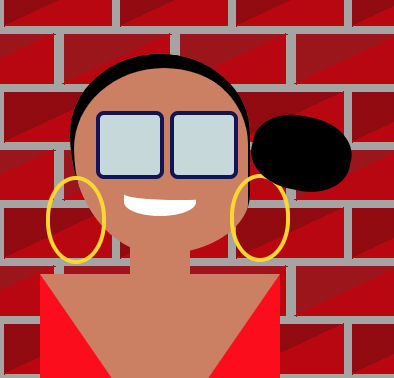
The Result #
Here is the codepen of my little exercise.
Learning Goal #
- Draw something easy with CSS.
- Practice the basics of making shapes and placing them around the drawing
- Practice the mindset of: what shape do I need to create and concatenate to make what?
The Markup #
<div class="nani">
	<div class="face skinColor">
		<div class="hair">
			<div class="curl"></div>
			<div class="curl"></div>
			<div class="curl"></div>
			<div class="curl"></div>
			<div class="curl"></div>
			<div class="curl"></div>
			<div class="curl"></div>
			<div class="curl"></div>
			<div class="curl"></div>
			<div class="curl"></div>
		</div>
		<div class="smile"></div>
		<div class="glasses"></div>
	</div>
 <div class="neck skinColor"></div>
<div class="bodyDaniela"></div>
You see there we have:
- One container that has all the elements.
- The face contains: Hair and the curls, the smile and the glasses.
- Then comes the neck and the body
Positioning the body parts with Flexbox #
Flexbox is a modern CSS layout feature that allows us to handle positioning elements in only one dimension, and has very powerful alignment properties.
You see in the code snippet below, that I am using flexbox to place all the body parts:
- In the center of the X axis of the viewport
- All the main body parts vertically on top of each other (face, neck, body)
.nani {
	display: flex;
	flex-direction: column;
	align-items: center;
	margin-top: 40px;
}
Face, neck and body shapes #
My neck is easy, just a rectangle with a negative margin, to hide behind the face.
The face is not a perfect circle. My face is more like an inverted triangle shape, or like an inverted egg.
The body is a simple inverted triangle.
.face {
	width: $headSize;
	height: $headSize + 10;
	border-radius: 50% 50% 50% 50% / 40% 40% 60% 60%;
	margin-bottom: 15px;
....

.neck {
	width: 30px;
	height: 20px;
	margin-top: -25px;
	z-index: 1000000;
	position: relative;
}

.bodyDaniela {
	border-left: 60px solid transparent;
	border-right: 60px solid transparent;
	border-top: 90px solid $skinColor;
}
You see there, that in order to achieve the inverted egg shape for the face, I set the height bigger than the with, to create kind of a perfect oval.
Then, to give it the shape of egg, I used the syntax border-radius that has the / operator.
This syntax allow us to create ellipsis shapes by controlling more specifics of the radius of the corners. This means, that the values of the corners will end up being:
    border-radius: 50% 50% 50% 50% / 40% 40% 60% 60%;
    border-top-left-radius: 50% 40%;
    border-top-right-radius: 50% 40%;
    border-bottom-right-radius: 50% 60%;
    border-bottom-left-radius: 50% 60%;
Meaning:
border-radius: top-left-1 top-right-1 bottom-left-1 bottom-right-1 /
               top-left-2 top-right-2 bottom-left-2 bottom-right-2;
There you see that the second radius value of both top corners is bigger: 40%. That creates a bigger circle shape, while in the bottom they are 60%, which creates a more narrow circle. The bigger the value, the more straight looking the line will be, the smaller the value, the more "swollen" the line will be. For example, if I set the values to be: border-radius: 50% 50% 50% 50% / 40% 40% 30% 60%;
It will look as if I had a grinder (tooth) problem and my face was swollen:
To understand the triangle shape, let's look again to the CSS:
  border-left: 60px solid transparent;
	border-right: 60px solid transparent;
	border-top: 90px solid $skinColor;
The border-top, gives the length to the triangle, and the border-left and border-right, give the width to the edges closer to the neck.
You might be wondering, yes but why this creates a triangle? I actually also wondered that too. To understand why this works I just added different colors to all the borders, and this is what happened:
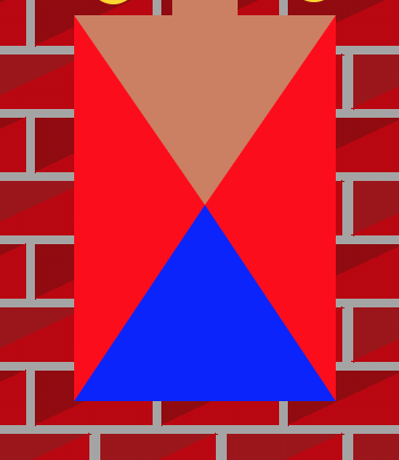
As the div does not have a width and height the borders expand doing a natural triangle shape, until they reach the center of the rectangle. So that when we add a triangle doing:
  border-left: 60px solid transparent;
	border-right: 60px solid transparent;
	border-top: 90px solid $skinColor;
We are:
- Giving the left and right borders the same size and a transparent background
- Giving the top border a higher size and a colored background
- Letting the bottom border unset
Which will basically draw the top part of the image I placed above, with the difference of not having color in the red parts.
Curious note: If you add width and height, there will be a shape in the middle. So when we are creating layouts, say a box with 1px border, as the content of the box is bigger than the border, it will seem as if "eats" that whole "triangle" shape of the borders. But in reality, that triangle shape remains there.
Why? Because when the borders of each of the edges of a square shape meet each other, the browser will draw a diagonal line. As we always use the same color for all the borders, we never see it.
Curious? Open the dev tools and try changing the colors of one border of a shape you have :) I did.
The curls #
To make the curls, I made a an oval that was wider than taller. At the beginning I made a perfect circle, but was not really looking like my hair, my curls are less tight, so the oval seemed a better choice.
The placing of the curls around my face was the challenge.
I thought about using trigonometry (sin, cos) to find the points at the edge of the circle that makes my face. Which would have worked if I knew the exact point that is in the center of the circle. In my case I did not know it because it will change depending on the viewport. So that was not an option.
The calculation of the points around my face's circle had to depend on the size of it. And in order to actually make it work, I placed the div that makes my hair and the curls inside the div of my face. So this way, as the face is the container element, it could be easier to actually find the points.
This is the HTML
<div class="face skinColor">
		<div class="hair">
			<div class="curl"></div>
			<div class="curl"></div>
			<div class="curl"></div>
			<div class="curl"></div>
			<div class="curl"></div>
			<div class="curl"></div>
			<div class="curl"></div>
			<div class="curl"></div>
			<div class="curl"></div>
			<div class="curl"></div>
		</div>
		<div class="smile"></div>
		<div class="glasses"></div>
	</div>
How did I solve it? In the codepen I am using SASS, which allows me to use mixins. I googled a bit, and found this mixin (which I adapted a bit to my needs). I will comment in within the code the interesting parts.
// mixin from: https://css-tricks.com/snippets/sass/placing-items-circle/
// circle size will be the size of my head, and the item size will be the size of the curl.
@mixin on-circle($item-count, $circle-size, $item-size) {
	position: relative;
        // My hair grows to the sides, so I made it wider than taller.
	width: $circle-size + 10;
	height: $circle-size;
	padding: 0;
	border-radius: 50%;

	> * {
		display: block;
		position: absolute;
		top: 50%;
		left: 50%;

    // These values are kind of arbitrary, I was just playing around with them
    // and kept the ones that felt closer to my hair
		width: $item-size + 10;
		height: $item-size - 3;

    // My hair is not a perfect circled curl, so I did not make it 50%
		border-radius: 45%;

    // This "centers" the curl vertically and horizontally.
		margin: -(($item-size / 2) +3);

    // This part is what makes the magic. I'll explain it below.
		$itemsRotate: $item-count - 1;
		$angle: -(200 / $itemsRotate);
		$rot: 0;

		@for $i from 1 through $itemsRotate {
			&:nth-of-type(#{$i}) {
				transform: rotate($rot * 1deg)
					translate($circle-size / 1.7)
					rotate($rot * -1deg);
			}

			$rot: $rot + $angle;
		}

		&:nth-of-type(#{$item-count}) {
			transform: rotate($rot * 1deg) translate($circle-size / 1.7)
				rotate($rot * -1deg);
		}

		&:last-of-type {
			transform: rotate($rot * 1deg) translate($circle-size / 1.65)
				rotate($rot * -1deg);
		}
	}
}
So, the location of the curls is using trasnform. The idea is:
- Give me the number of items to place around the circle
- We will given that we have the circle size, we will decide where to place the curls based on angles. A circle makes an angle of 360 degrees, as the hair grows only on top and the sides, I picked an angle of: 200 degrees.
- For each of the curls, we will calculate the angle where we will place the curl. We do that by dividing the total degree number: 200 by the amount of items we want to place. (I'll explain the -1 below)
    $itemsRotate: $item-count - 1;
		$angle: -(200 / $itemsRotate);
		$rot: 0;
Then you see, that taking advantage of transform we can easily say: rotate this item to $angle and then we will translated it right to the edge of my face. This is done by dividing the total circle size / 2 (radius). I deliberately picked a number sightly smaller than 2, because I really don't wear my hair on my face, I find it actually annoying, I always move it a bit to the sides. By picking a smaller number the point where the curl was translated, ended up being wider.
		@for $i from 1 through $itemsRotate {
			&:nth-of-type(#{$i}) {
				transform: rotate($rot * 1deg)
					translate($circle-size / 1.7)
					rotate($rot * -1deg);
			}

			$rot: $rot + $angle;
		}
Then we have these two elements. I placed them outside the function, because I have longer hair, and wanted to have some that were a bit "hanging"
		&:nth-of-type(#{$item-count}) {
			transform: rotate($rot * 1deg) translate($circle-size / 1.7)
				rotate($rot * -1deg);
		}

		&:last-of-type {
			transform: rotate($rot * 1deg) translate($circle-size / 1.65)
				rotate($rot * -1deg);
		}
How the rotate and translate work? #
The concepts come from math. Around a circle, an element can rotate and translate. To understand them better, think of the rotation and translation movements of the earth.
- Translate (as of translation): It's the movement of an object around some space. The earth for example translates over an ellipsis around the sun, because of that we have seasons.
- Rotate (as of rotation): This is the movement of the object around one of its own axis. The earth rotates over one of it axis, and because of that we have day and night.
How this exactly works, is something I want to learn next. However, what the specific order of the rotate, translate, rotate does is:
- First rotate: moves the curl around the my face's shape
- Translate: Moves the curl from the center of my face, to the edge
- Second rotate: rotates the curl so that its horizontal-ish ellipsis shape stays horizontal all the time, regardless of where around my face is.
You might be wondering, what is that black semicircle in that image? That is what gives the frame to the forehead and sides of the face. It's done with inset box-shadow. Why box shadow? Well, box shadow is there to add a shadow at the frame of an element. I wanted to frame my face :)
box-shadow: inset 2px 7px black, inset -1px 5px black
In there you see two definitions. The first one sets the box shadow to the left side of my face, and the second one to the right.
The smile and the glasses #
The smile is easy, two semi circles, one sightly rotated (because I don't smile mathematically perfect) and the other one longer.
.smile {
	display: inline-block;
	margin: 0 1em 1em 0;
	background-color: white;
	border-bottom-left-radius: 50%;
	border-bottom-right-radius: 50%;
	width: 36px;
	height: 14px;
	position: absolute;
	top: 60%;
	left: 50%;
	transform: translate(-50%, 50%);
	z-index: 10;

	&:before {
		content: "";
		width: 55px;
		height: 6px;
		top: 0;
		left: 0;
		position: absolute;
		background-color: $skinColor;
		border-bottom-left-radius: 50%;
		border-bottom-right-radius: 50%;
	}
}
By defining border radius to the bottom, we make the semi circle. And as a smile is more like a longer and flat semi circle, I made it a semi ellipsis.
	border-bottom-left-radius: 50%;
	border-bottom-right-radius: 50%;
	width: 36px;
	height: 14px;
The second semicircle gives some round shape to the top of my smile. This one is a bit longer, and has my skin color as background color, so that it covers the flat top part of the smile, and gives a more "natural" smile effect.
		width: 55px;
		height: 6px;
		background-color: $skinColor;
		border-bottom-left-radius: 50%;
		border-bottom-right-radius: 50%;
The glasses #
They are also straight forward. Just one div, with some size, and as a before and after has defined both glasses. They are a simple squared div, with rounded corners and absolute positioned to the sides.
.glasses {
	width: 36px;
	height: 25px;
	position: absolute;
	top: 16px;
	left: 53%;
	transform: translate(-50%, 50%);
	z-index: 10;

	&:before,
	&:after {
		content: "";
		width: 30px;
		height: 30px;
		border: 2px solid #121252;
		background-color: #c6d8da;
		border-radius: 4px;
		top: 0;
		position: absolute;
	}

	&:before {
		left: -17px;
	}
	&:after {
		right: -18px;
	}
}
What I learned #
- How to start thinking on what to do with divs and CSS to create shapes
- When to use new layout techniques like flexbox and when is useful to absolute position.
- Now that we mentioned absolute position. Just because it's old does not mean is evil. Using this to position my smile and the glasses made total sense because there is no real mathematical function or automatic content-based layout property I could use to place eyes and smile in a way that looks natural. This had to be arbitrary.
- Finally understood what the syntax of
border-radius: x x x x / x x x xdoes. And `box-shadow: x , x; - Finally understood how the mechanics of creating a triangle works.
- How to make an egg shape.
- Face shapes, smiles, and locating eyes and smiles around the face needs to be imperfect, drawing humans is not about making geometrically perfect figures.
Useful links #
- Basic shapes in CSS
- Deeper explanation of positioning elements around the X, Y and Z axis with the
transformproperty
Things I want to understand better #
- Practice to understand deeply how the and why the order of
rotate transform rotatehad to be exactly that way. How the order affects the coordinate system.